Crafting Eye-Catching Flyers with Canva: A Comprehensive Guide

Introduction: Flyers are versatile marketing tools used to promote events, products, services, and businesses. Designing an effective flyer requires attention to detail, creativity, and the right tools. Canva, a popular online graphic design platform, offers a wide range of features and templates to create stunning flyers effortlessly. In this comprehensive guide, we will explore the principles, techniques, and best practices for designing flyers in Canva, empowering users to create visually appealing and impactful promotional materials for their needs.
- Understanding Flyer Design: Before diving into flyer design, it’s essential to understand the purpose and audience of your flyer. Determine the key message you want to convey and the target audience you want to reach. Whether you’re promoting a concert, a new product launch, a special offer, or a community event, tailor your flyer design to resonate with your audience and achieve your marketing goals.
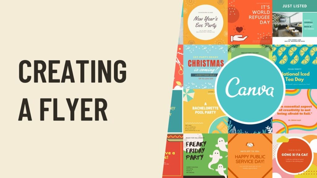
- Choosing the Right Template: Canva offers a vast library of professionally designed flyer templates, ranging from elegant and minimalist designs to bold and vibrant layouts. When selecting a template, consider the tone, theme, and purpose of your flyer. Choose a template that reflects your brand identity, aligns with your design vision, and captures the attention of your target audience.
- Customizing Your Flyer Layout: Once you’ve chosen a template, it’s time to customize your flyer layout in Canva. Use Canva’s intuitive drag-and-drop interface to add text boxes, images, shapes, icons, and other design elements to your flyer. Experiment with different layouts, arrangements, and compositions to create a visually appealing and well-balanced design.
- Incorporating Compelling Visuals: Visuals play a crucial role in flyer design, as they help grab attention and convey information quickly. Use high-quality images, illustrations, and graphics that are relevant to your message and appeal to your audience. Canva provides a vast library of stock photos, illustrations, and icons that users can incorporate into their flyers to enhance visual appeal.
- Crafting Clear and Concise Copy: The text on your flyer should be clear, concise, and easy to read at a glance. Use short, compelling headlines and concise body text to communicate your message effectively. Avoid cluttering your flyer with excessive text or complex language that may overwhelm or confuse your audience. Use Canva’s text tools to customize fonts, sizes, colors, and styles to make your text stand out.
- Highlighting Key Information: Make sure to highlight key information such as event details, dates, times, locations, contact information, and calls-to-action prominently on your flyer. Use visual hierarchy techniques such as font size, color, and placement to emphasize important details and guide the reader’s attention. Ensure that essential information is easy to find and understand to encourage engagement and action.
- Adding Branding Elements: Incorporate branding elements such as logos, brand colors, and typography into your flyer design to reinforce brand identity and increase brand recognition. Place your logo strategically in a prominent position on your flyer and use brand colors consistently throughout the design. Consistent branding helps create a cohesive and professional look that aligns with your brand image.
- Using White Space Effectively: White space, also known as negative space, plays a crucial role in flyer design by enhancing readability and visual appeal. Use white space strategically to create breathing room around text and images, allowing them to stand out and grab attention. Avoid overcrowding your flyer with too many elements or cluttered design elements that may confuse or overwhelm your audience.
- Experimenting with Colors and Fonts: Color and typography are powerful design elements that can evoke emotion, convey personality, and enhance brand identity. Experiment with different color palettes and font combinations to find the perfect balance that reflects your brand and appeals to your audience. Canva offers a wide range of colors and fonts to choose from, as well as pre-designed color schemes and font pairings for inspiration.
- Reviewing and Proofreading: Before finalizing your flyer design, take the time to review and proofread it carefully for errors, inconsistencies, and typos. Check for spelling mistakes, grammatical errors, and alignment issues that may detract from the professionalism of your flyer. Consider asking a colleague or friend to review your flyer as well to provide feedback and suggestions for improvement.
- Saving and Sharing Your Flyer: Once you’re satisfied with your flyer design, it’s time to save and share it with your audience. Canva allows users to download their flyers in various formats, including PDF, JPEG, and PNG, for printing or digital distribution. Users can also share their flyers directly from Canva via email, social media, or link sharing to reach their target audience quickly and efficiently.
Conclusion: Designing flyers in Canva is a creative and empowering process that allows users to create visually appealing and impactful promotional materials for a wide range of purposes. By following the principles, techniques, and best practices outlined in this guide, users can leverage Canva’s intuitive design tools and vast library of resources to craft flyers that capture attention, convey information effectively, and drive engagement with their target audience. Whether you’re promoting an event, a product, a service, or a cause, Canva provides the flexibility and versatility you need to design stunning flyers that make a lasting impression and achieve your marketing objectives.


