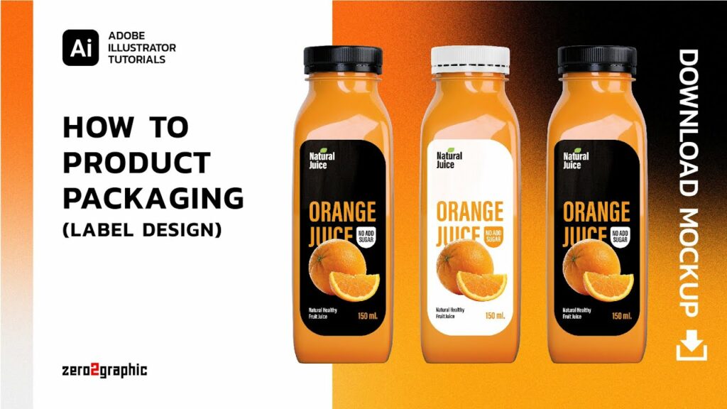
Unveiling the Product: A Comprehensive Guide to Designing Packaging Labels in Adobe Illustrator
The captivating world of packaging design beckons! In this odyssey, we’ll delve into the art of crafting compelling packaging labels using Adobe Illustrator, transforming a blank canvas into a powerful marketing tool and an extension of your brand identity. From conceptualizing your design to ensuring flawless printing, this guide will equip you to create labels that not only inform but also entice and leave a lasting impression on consumers.
Part 1: Laying the Foundation – Understanding Your Needs
The journey begins with a clear understanding of your product, target audience, and the specific information your label needs to convey. Here’s what to consider:
Product Knowledge: Thoroughly understand the product’s features, benefits, and target use case. This knowledge forms the cornerstone of your design decisions, ensuring the label effectively communicates the product’s value proposition.
Target Audience: Identify your ideal customer. Consider their demographics, purchasing habits, and what resonates with them visually. This understanding empowers you to craft a design language that speaks directly to their needs and preferences.
Label Requirements: Research any legal regulations or industry standards that dictate mandatory information on your label. This includes ingredients lists, nutritional information, safety warnings, and barcodes.
Part 2: Setting the Stage – Document Setup and Workspace
With a clear roadmap in mind, let’s prepare your digital canvas in Illustrator:
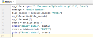
Document Setup: Launch Illustrator and create a new document (File > New). Define the document size based on your label’s dimensions. Consider including bleed areas (extra space around the edges) to accommodate potential trimming variations during printing.
Workspace Optimization: Customize your workspace for efficient label design. Arrange essential panels like the Layers panel (Window > Layers) and the Swatches panel (Window > Swatches) for easy access. Utilize guides (View > Guides) to establish a grid system that promotes visual harmony and alignment of design elements.
Color Palette Selection: Establish a color palette that aligns with your brand identity and resonates with your target audience. Consider color psychology and how different colors evoke specific emotions or associations. Explore tools like the Recolor Artwork tool (Edit > Recolor Artwork) to experiment with various color schemes on existing elements, allowing for rapid visual exploration.
Part 4: Building the Label – Core Design Elements
Now, let’s breathe life into your label by incorporating key design elements:
Logo and Brand Identity: Your logo is the cornerstone of brand recognition. Integrate your logo prominently into the design, ensuring it’s clear and visually balanced within the label composition. Consider using brand-consistent typography and color schemes to reinforce brand recognition.
Product Name and Description: Present the product name prominently using clear and legible fonts. Consider using hierarchy (varying font sizes or weights) to differentiate the product name from secondary information. Craft a concise and compelling product description that highlights key features and benefits, enticing consumers to learn more.
Imagery and Visual Appeal: Incorporate high-quality images that showcase your product in its best light. Explore using lifestyle photography, product close-ups, or even illustrations depending on your brand aesthetic and the nature of your product. Utilize the Pathfinder panel (Window > Pathfinder) to create clean cut-out shapes for your images, ensuring seamless integration into the overall design.
Part 5: Polishing the Details – Refining Your Design
With the core elements in place, focus on refining the details and elevating your label’s visual impact:
Typography and Readability: Choose fonts that are clear, legible, and align with your brand identity. Avoid overly decorative or complex fonts that might hinder readability. Consider using different font sizes and weights to create visual hierarchy and guide the reader’s eye through the information on the label.
Composition and Balance: Arrange all label elements to create a visually balanced and harmonious composition. Utilize the principles of design, such as rule of thirds or negative space, to guide your placement decisions. Experiment with different layouts and configurations to achieve a visually appealing and informative arrangement.
Mockups and Presentation: Visualize your label design in real-world scenarios. Utilize mock-up templates (either physical or digital) to see how your label will appear on the actual product packaging. This allows you to refine the design for optimal impact on the final product.