Crafting Visual Symphony: A Comprehensive Guide to Creating Color Harmonies in CorelDRAW
Introduction:
Color harmonies are the heart and soul of visually striking and cohesive designs, playing a vital role in conveying emotions, establishing brand identity, and creating memorable visual experiences. CorelDRAW, a leading vector graphics editor, empowers designers to master the art of color harmonies with precision and creativity. This comprehensive guide explores the intricate process of creating color harmonies in CorelDRAW, emphasizing the importance of harmonious color schemes, step-by-step instructions for crafting harmonies, and advanced techniques to unlock the full potential of this feature.
Section 1: Understanding the Essence of Color Harmonies
1.1 Defining Color Harmonies: Color harmonies involve the strategic combination of colors based on their relationships on the color wheel. Delve into the significance of color harmonies in graphic design, where well-crafted schemes enhance aesthetics, communicate messages, and create memorable visual identities.
1.2 The Emotional Impact of Color Harmonies: Explore how color harmonies influence emotions and perceptions. Different harmonies evoke distinct feelings, and understanding these nuances allows designers to create designs that resonate with their intended audience.
Section 2: Navigating CorelDRAW’s Color Harmony Options
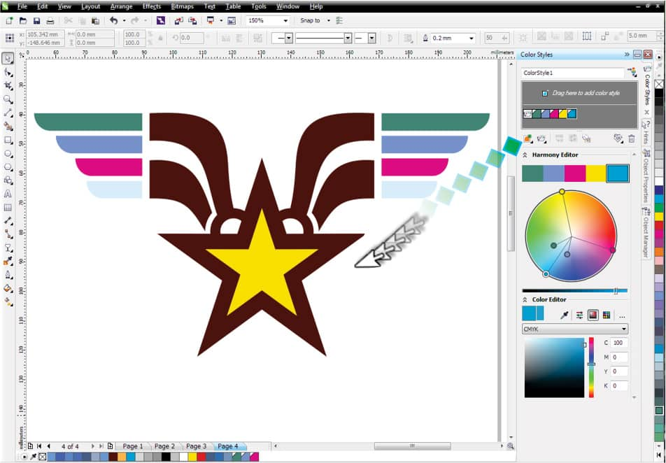
2.1 Exploring CorelDRAW’s Color Harmony Tools: Familiarize yourself with the Color Harmony docker, a central tool in CorelDRAW for managing and creating color harmonies. Understand its features, including the ability to choose from various harmony types and customize schemes effortlessly.
2.2 Understanding Harmony Types: Recognize the different types of color harmonies available in CorelDRAW, such as complementary, analogous, triadic, and more. Each harmony type offers a unique approach to color combinations, allowing for versatile and creative design possibilities.
Section 3: Step-by-Step Guide to Creating Color Harmonies
3.1 Selecting the Base Color: Initiate the process by selecting the base color from which you want to derive a color harmony. This color will serve as the starting point for defining your harmonious color scheme.
3.2 Accessing the Color Harmony Docker: Navigate to the Color Harmony docker within CorelDRAW. Gain a comprehensive understanding of its layout and functionality, including options for choosing harmony types, adjusting color properties, and previewing harmonies in real-time.
3.3 Choosing the Harmony Type: Explore the various harmony types available and choose the one that best suits your design objectives. Whether aiming for contrast, cohesion, or a specific emotional impact, selecting the right harmony type is crucial for achieving the desired effect.
3.4 Adjusting Color Properties: Fine-tune the color properties within the Color Harmony docker. CorelDRAW provides options for adjusting hue, saturation, brightness, and other properties to customize and refine your chosen color harmony.
3.5 Previewing and Confirming the Harmony: Utilize the real-time preview feature to assess the visual impact of your selected color harmony. Confirm your choices, ensuring that the harmony accurately captures the desired aesthetic and emotional tone for your design.
Section 4: Applying Color Harmonies to Objects
4.1 Selecting Target Objects: Explore the process of applying color harmonies to other objects in your design. Choose the target objects that you want to enhance with the harmonious color scheme defined in the Color Harmony docker.
4.2 Accessing the Color Harmony Docker for Application: Navigate back to the Color Harmony docker. Learn how to access the created color harmony and apply it to the selected objects, instantly imparting the chosen harmonious color scheme to your design elements.
4.3 Fine-Tuning Color Harmony Applications: Understand how to fine-tune the application of color harmonies. CorelDRAW allows for flexibility in adjusting the intensity, saturation, or proportions of specific colors within the harmony, providing nuanced control over your design’s visual impact.
Section 5: Advanced Techniques for Color Harmony Customization
5.1 Modifying Existing Color Harmonies: Delve into the advanced features of modifying existing color harmonies. Learn how to make adjustments to the harmony’s color properties, accommodating changes in design requirements or evolving preferences.
5.2 Creating Custom Harmonies: Explore techniques for creating custom color harmonies. This advanced approach involves manually selecting and arranging colors to achieve a unique and tailored color scheme for your design.
Section 6: Troubleshooting and Tips for Effective Color Harmony Management
6.1 Addressing Harmony Consistency Challenges: Understand how to troubleshoot color consistency challenges when applying harmonies across different objects, projects, or versions of CorelDRAW. Explore tips for ensuring seamless harmony integration.
6.2 Managing Harmony Libraries: Learn effective strategies for managing your color harmony libraries. From organizing harmonies to creating backups, efficient management ensures a streamlined workflow and easy access to the harmonious color schemes you need.
Section 7: Collaborative Workflows and Color Harmony
7.1 Sharing Color Harmonies: In a collaborative design environment, explore methods for sharing color harmonies with team members. Learn how to export and import harmonies to maintain consistency across projects.
7.2 Establishing Harmony Guidelines: Enhance collaborative workflows by establishing guidelines for color harmonies. Communicate best practices and conventions to ensure a unified approach to harmonious color schemes across the design team.
Conclusion:
In conclusion, the ability to create color harmonies in CorelDRAW is a powerful skill for designers seeking to elevate their designs with visually striking and emotionally resonant color schemes. Whether you are a seasoned professional or a newcomer to the world of graphic design, this comprehensive guide equips you with the knowledge and techniques needed to harness the power of color harmonies. By understanding the essence of harmonies, navigating CorelDRAW’s color harmony options, following a step-by-step guide for creating harmonies, applying them to other objects, exploring advanced customization techniques, and implementing effective troubleshooting and collaborative workflows, designers can unlock the full potential of CorelDRAW’s color harmony features for a visually captivating and harmonious design experience.